

Stuck in the Middle
How better strategy practices can keep mid-priced brands from getting squeezed


The middle: rarely a position of power.
The middle child, middle managers, and the middle seat on an airplane all suffer from pressure on two sides. To be in the middle means a lack of both ownership and agency.
Brands in the middle are no exception, and the downsides of being in the middle are in sharp focus in the current economic climate.
Brands and retailers at the low end are generally in good shape.
Walmart increased their revenue forecast for the year.
E.l.f. Beauty, with its $10 lipsticks, is flourishing.
Consumers are treasure-hunting at TJ Maxx with abandon.
The high end, buoyed by upper-income customers with thriving stock portfolios, is also hanging tough.
The middle, meanwhile, is lagging. Bath & Body Works reported a 1% decline in year-over-year revenue. Discretionary spending for big-ticket items at Home Depot is sagging. And brands like Yankee Candle appear to be flailing.
Yankee Ingenuity?
I started paying attention to Yankee Candle in July when I read an article in Modern Retail about the company’s rebranding efforts. What caught my eye was a sentence about consumer research:
‘Yankee Candle did multiple rounds of consumer research and led focus groups to figure out what people liked about Yankee Candle and what could be updated.’
I am always curious about the types of research companies use to develop and evaluate new strategies. Focus groups and interviews make me nervous: too often, companies extrapolate strategic options from a very small set of customer interactions and end up limiting possibilities. I wondered if that would happen here.
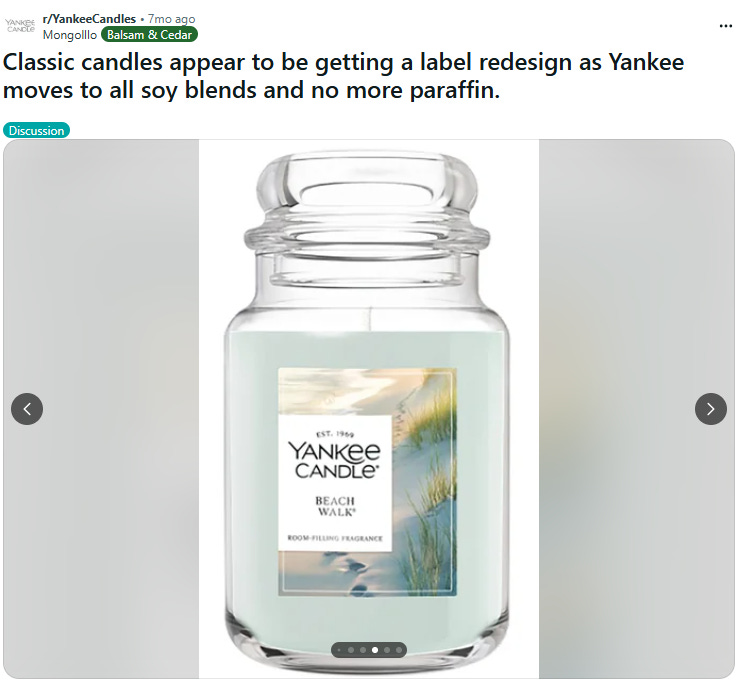
I did not have to wait long. The result of the research and brand work was a new look intended to make Yankee Candle more appealing to younger consumers. Yankee Candle redditors picked up on it early:
Outrage ensued, of course. A few samples:
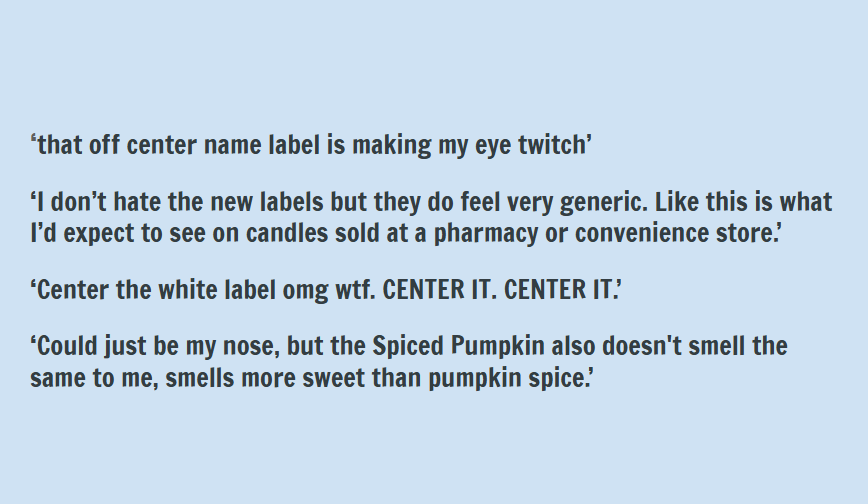
The bandwagon effect was in full force.
Let’s Grow
Rebranding is one solution to a classic strategy problem: We need to grow. How do we appeal to new target audiences without alienating the old ones?
Some brands, like Banana Republic, play on their heritage to draw in both old and new customer groups. BR unveiled a new look in 2021-22 that drew on the world explorer tropes of its early catalog days—safari vibes, leather, and globe-trotting looks that were more elevated than before.
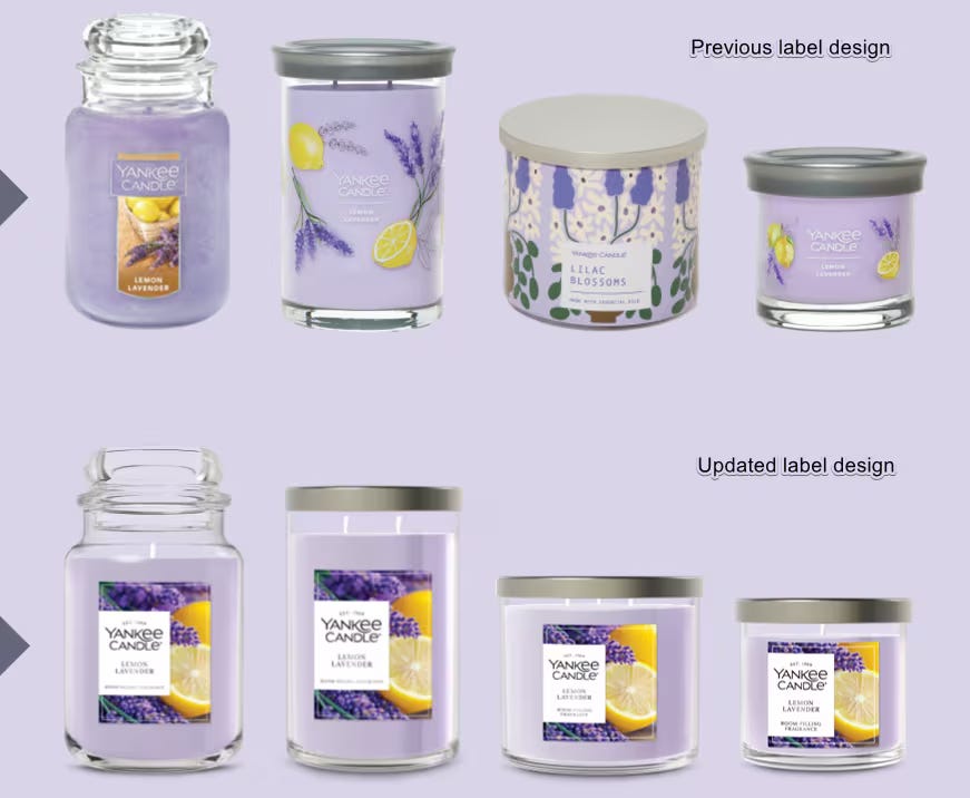
Yankee Candle was not so ambitious. The rebrand seemed to focus primarily on an updated label with bigger, more evocative imagery, and a new logo, although the company also made a change to its wax formula.
Both Banana Republic and Yankee Candle’s strategies appear to have failed. Banana Republic alienated customers because new elevated looks had higher prices and because safari looks are not what customers expect to find at the mall. Corporate parent Gap Inc. still considers Banana Republic a ‘work in progress.’
The specifics of Yankee Candle’s failure are more vague. The parent company, Newell Brands, is laying off 900 people and closing 20 of about 240 Yankee Candle stores. There is talk of tariffs and higher prices turning off customers; whatever the issue, the rebrand didn’t fix it, and the top line is sagging.
Rebranding Is Strategy
Rebranding should be the culmination of business strategy development. Too often, it’s based on a wing and a prayer—a new look or logo not rooted in anything substantial.
Companies in the middle have an especially hard time with rebranding. Existing and prospective audiences can leave in two directions—in this case Target and Walmart on the lower end and brands like Boy Smells and Nest on the high end.
Being in the middle means that brands need real differentiation and a solid value proposition to hold the line, let alone grow. When a brand introduces change, like a new look or logo, it needs to align with the business strategy. Alternatively, like Banana Republic, a rebrand can introduce a foundational shift in value proposition.
But any change is risky.
How do you know if you’ve got it right—that you’re not just delivering cannon fodder for cranky customers (viz: Cracker Barrel, 2025)?
How do you make sure that your existing brand fans will love the new approach and that you will attract new customers, too?
Most importantly, how do you answer these two questions before you launch?
Do Diligence
Brands in the middle have less margin for error. A luxury brand can survive a bad season (rich clients are loyal). A budget brand can survive a bad logo (people still need cheap goods). But a Middle brand? If you miss the mark, your customer leaves for Amazon instantly.
This is where classic strategy processes break down. The linear process of industry analysis, market position, and customer research usually drives to a single answer—a single strategy that informs new brand guidelines.
But in my experience, there is usually more than one viable strategy. The competition among them takes place behind the scenes, where execs and agencies negotiate with themselves. The competition among strategies doesn’t happen where it should: among potential customers.
This is why the linear strategy process fails them. It relies on intention, not reaction. Modern strategy testing prior to launch validates direction based on real-life behavior, not opinions. It de-risks the big moves that can sink results and cut careers short.
Thanks to the ubiquity of digital interaction, testing strategy is fast: using advertising to test big brand moves with discrete audiences can take place within a matter of weeks. It’s highly effective: running experiments with side-by-side strategies shows which one delivers the most interest, engagement, and conversion from new and existing audiences.
Btw, I have almost always been surprised by the ‘winner’ of a branding bake-off. My clients have, too.
The last couple of years have been littered with failed or meh rebranding efforts: Western Union, Bumble, We♥️NY , and at least some of the corporate blanding victims. It’s tough out there—and arguably getting tougher.
Isn’t it time to change the way we change?
Great analysis, and I love the Yankee Candle example.
After reading this, I looked at their online store to get a better sense of how they're using the new packaging. The critics are right—it's blah, lacking imagination and nerve. Candles and home fragrances aim to fill a need for sweetness, calm, reverie—imagination! These labels have far too much text, making them visually demanding while you're actually using them, and, I'm sorry, but no one wants to stare at your brand signifiers while trying to de-stress from their workday.
Also, I get it that the label has to intimate the fragrance inside (which can also be telegraphed by the color of the wax), but the label imagery is literal and descriptive rather than evocative and aspirational. I would have headed in a completely different direction, graphically. But, to your point, I would have *tested* my visual theories first before betting the farm on my design.